Identity Design & Branding, Web Design
Grandview Pastures
Client
Grandview Pastures
Role
Designer, Illustrator
Completed @ Copeland Design
Grandview Pastures is a 3rd-generation family farm in Trenton, Ontario focusing on regenerative, pasture-based farming. This small operation makes a big impact and supports their overall regenerative mission: for the animals, the community, and the earth.

Concept and Positioning
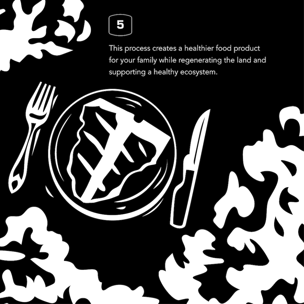
Regenerative farming includes: humanely-raised animals, reversing soil damage, and creating a nutrient-dense food product that improves the overall health of a community. As the antithesis of the farm's corporate neighbors, we positioned Grandview Pastures with an emphasis on their humanity at the intersection of rural and modern. The brand identity reflects this.
Tagline
As a riff on the “farm-to-table” format, “Honest to Goodness” reflects the ways that being good to your animals and land will help them be good to you. Additionally, this down-to-earth and familiar phrase connects the farm to their local community, and describes both their farming practices and their grand mission.
The Logos
The name Grandview comes from the “grand view” that the Lange’s family found when they settled there in 1959. Aptly, we were able to portray the family’s old barn in a pastoral illustration featuring a foraging cow. Custom logotype was designed — “Grandview” creates a sweeping panoramic shape in a modern slab-serif typeface; “Pastures” is hand-drawn in a script style reminiscent of the hand-painted lettering on their family’s barn — and reiterates their modern yet traditional brand. The logotype, illustration, tagline, and location all assemble in a keylined rectangular viewfinder shape, creating a classic and sleek badge. Components can also be removed from the badge for adaptability and scale.


