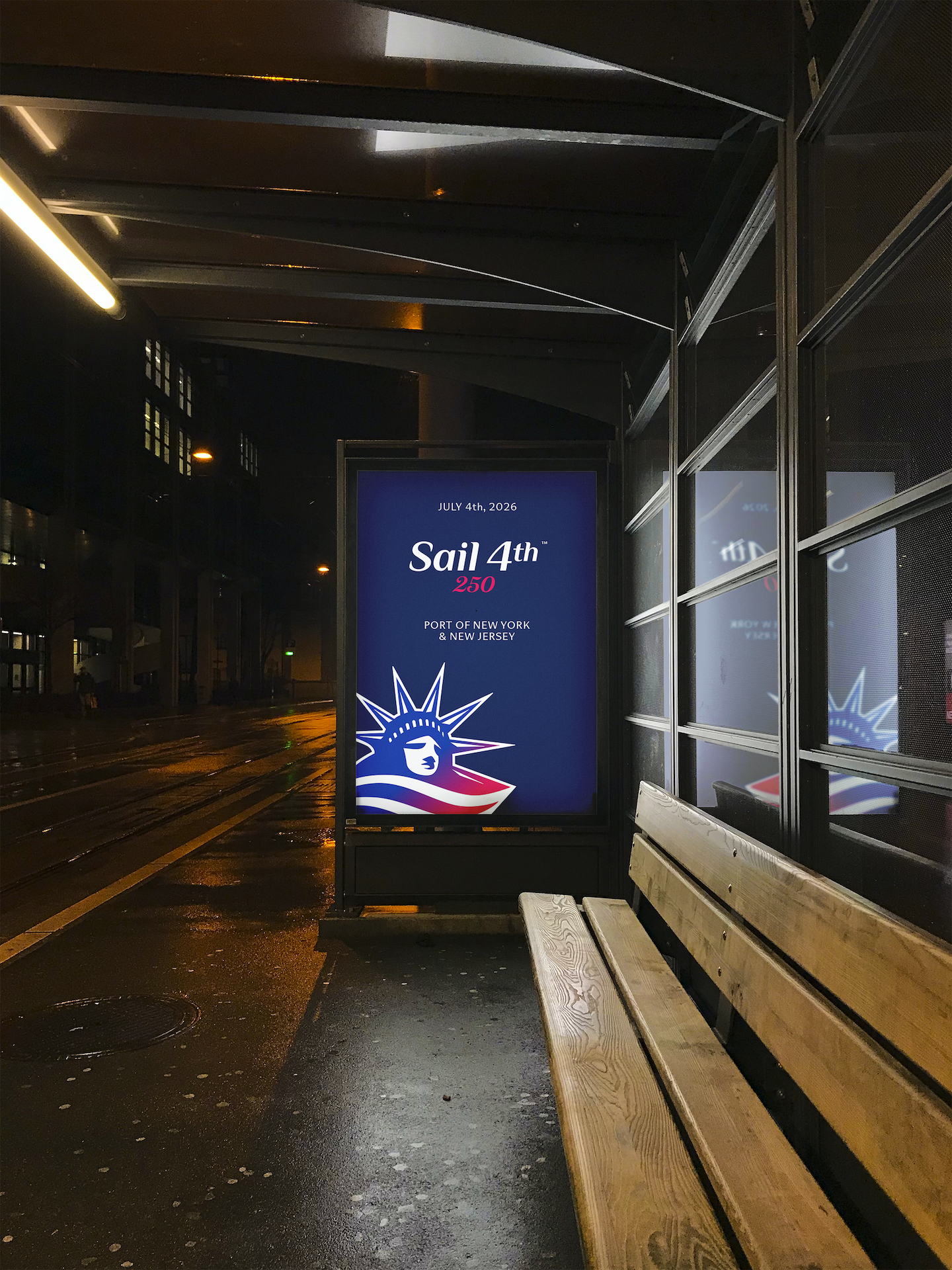
Identity Design & Branding, Web Design, Animation
Client
Sail 250 NYC
Role
Designer
Completed @ Copeland Design
Sail4th 250
July 4th, 2026 marks the 250th anniversary of the United States, or semiquincentennial. Sail4th 250 will host the tall ships of the world in the Port of New York and New Jersey to commemorate this historic moment. Copeland was asked to create a new brand identity for this event to excite, educate, and engage prospective audiences ahead of the semquin.
Concept and Positioning
As the reigning host of tall ships events in New York Harbor, Sail 250 NYC looked to differentiate itself from other Sail 250 events nationwide. Copeland renamed the event Sail4th 250, repositing it to be forward-moving and unifying. The organization wanted to refresh the brand identity alongside the name to align with event and sponsorship goals and modernize for a 2026 audience. The resulting explorations connect to themes of coming together, celebration, and optimism. I experimented with both traditional and modern styles and minimized the use of more obvious tall ship references.
The Symbol
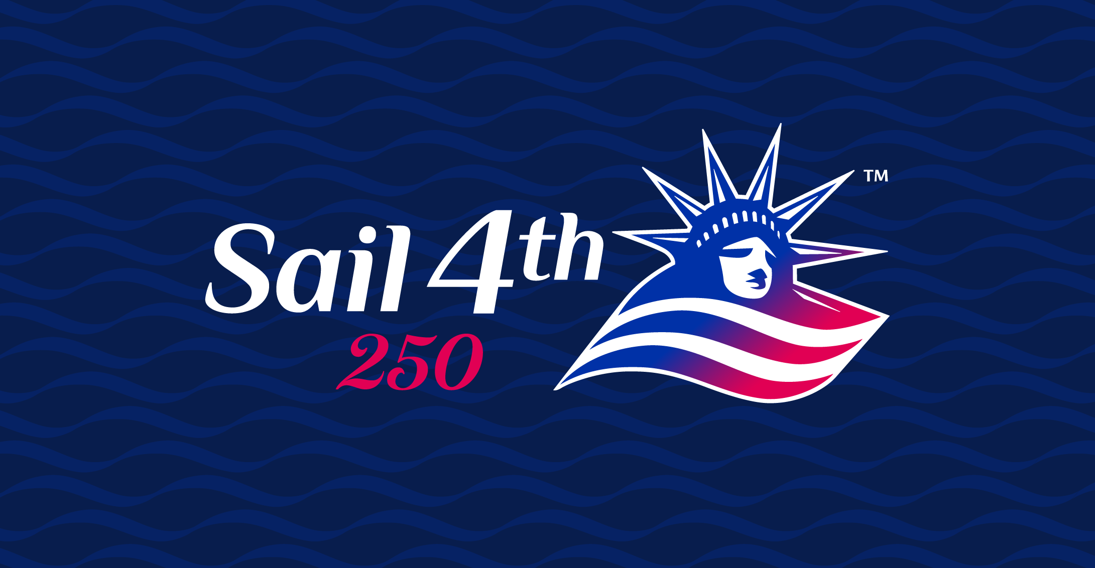
After creating hundreds of sketches and receiving feedback from the client and creative director, we landed on the Statue of Liberty as a muse. She is an iconic symbol for the U.S. and can reference the tall ships entering New York Harbor in the past and present while positioning Sail4th 250 as a distinctly New York/New Jersey event.
I initially tried to combine some of her features — her crown, torch, and face — with sails and other tall ship symbols, but these were too intricate. Ultimately, I simplified a version of her head, cropped by a waved line. Adding two more angled waves, she creates a dynamic, forward-looking flag shape that references sailing and classic American iconography in a new way that is completely unique to the brand. I applied a blue-to-red gradient to include classic American colors in a modern, blended way.
The Logotype
Initial typographic explorations for Sail4th focused on more traditional script typography to balance out the more modern style of the symbol. A modified version of a 1700s-inspired script typeface was proposed but ultimately replaced with a more contemporary, structured, and readable typeface. I modified this italicized sans-serif typeface by smoothing out any sharp corners, opening up the counters, simplifying the spurs to match the style of the symbol, and arching the counter of the 4 to mimic the shape of a sail.
To contrast the modern style of Sail4th, I created a customized 250 referencing the Roman style of early U.S. documents.
The Animation
Like the symbol, I wanted to reference tall ships coming together to celebrate the U.S. without being too literal. The points of Lady Liberty’s crown (which aptly reference the 7 seas and continents of the world) shine and animate like sails coming over the horizon or rays of sunlight. The points then morph into place in the symbol, and the details of her face animate revealing her as the Statue of Liberty. The waves roll in creating the flag shape while the logotype reveals itself from behind and 250 gets written into place.

The Identity
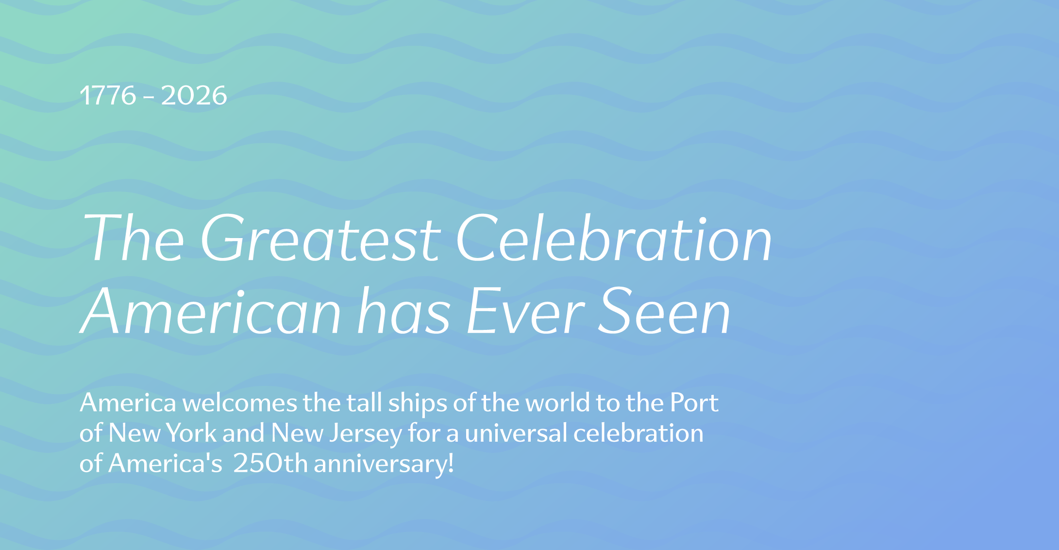
Sail4th 250’s visual system creates a consistent and energetic look for all of the events across locations and applications. Colors, patterns, and gradients enhance the brand’s effect and produce dynamic and exciting visuals. Initial applications include web, social, and merchandise, with the ability to expand across any platform.
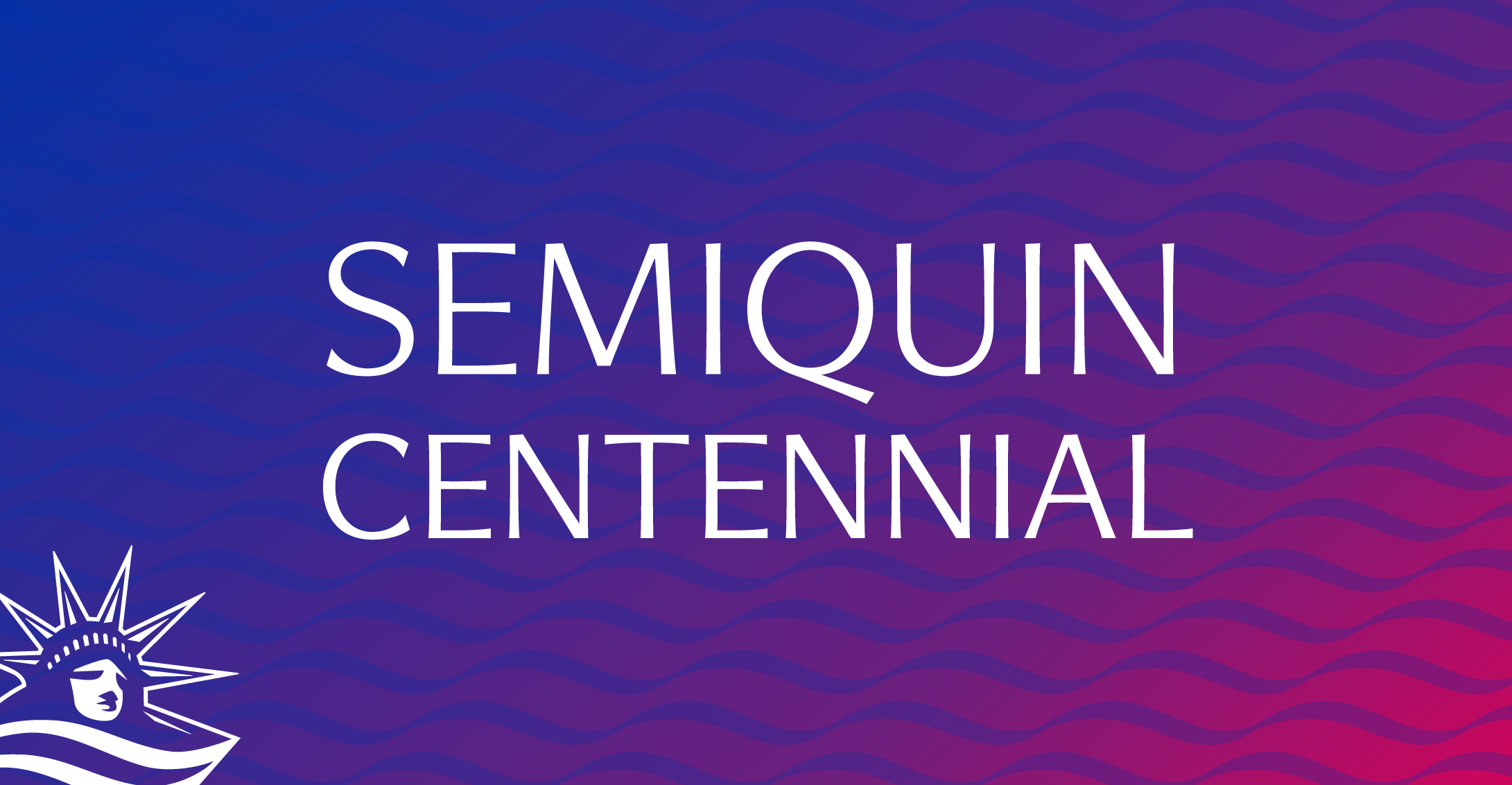
A traditional core American color palette is updated to be bright and cool, creating an electric energy with balanced contrasts. The expanded palette includes a Majestic Purple — created from combining the core red and blue — and a light Liberty Green. These colors create multiple combinations of gradients that create movement within the applications.
The main brand typeface is a sans-serif with concaved strokes that add visual interest while being legible and professional. Large, light, italic header styles create a dynamic and airy energy throughout the designs.
Wave patterns take shape from the symbol’s waves. Patterns combine with gradients and typography to create a consistent and colorful design language for the brand.
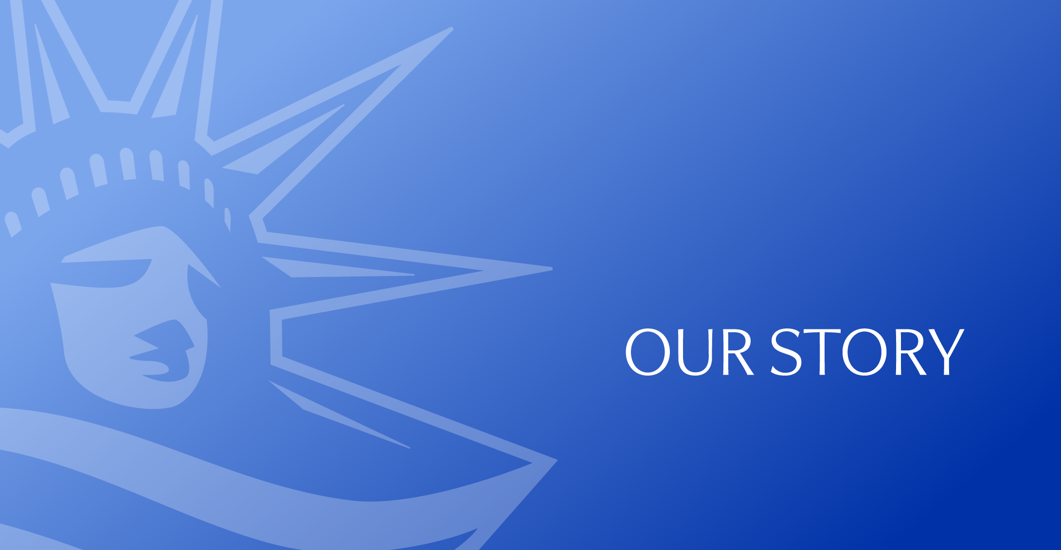
The Liberty Sails symbol creates a small corner symbol, or as a large background element, framing designs and creating consistent branded moments.
Applications
Initial applications include web, social, promotional, and merchandise, with the ability to expand across any platform as the event day approaches. Applications utilize the brand toolkit to create clear and concise or bold and energetic graphics, depending on the context.


Web and Social

