Identity Design & Branding, Web Design, Animation
Client
Fiber Industries
Role
Designer
Completed @ Copeland Design
Darling Fibers
Fiber Industries is a textile manufacturing company located in Darlington, SC making the shift towards sustainability. While working to create a more sustainable product, the company positioned its brand as an innovative, yet familiar home for its employees and the surrounding community. As a reference to their longstanding ties to the Darlington community, Copeland renamed them Darling Fibers and developed a unique, forward-thinking identity that enhances their legacy while driving them into the future.
Concept and Positioning
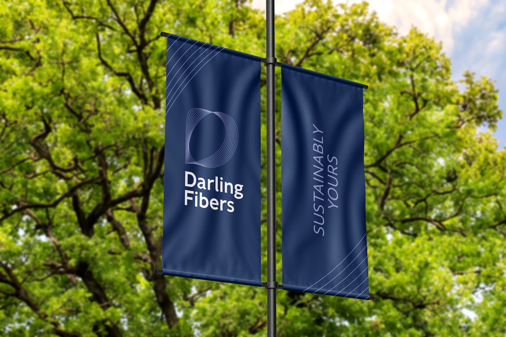
Darling’s new brand positioning is symbolized in its identity by an upper-case D formed by overlapping spirographic loops. The symbol references forward motion, fiber strands, and sustainable cycles. It is strong yet delicate, and completely authentic to Darling Fibers. To keep the symbol scalable, three variations were created with diminishing numbers of fiber strands.
The delicate fiber strands from the symbol are balanced by the structured logotype. The logotype further enhances the brand positioning and is both friendly and professional. The tall x-height creates more open letterforms and makes the weight feel more approachable. This medium weight allows the name to be bold without being too harsh. The curved terminals further soften the feel of the type without being too sweet.
Launch Video
To celebrate Darling Fibers’ launch, this video briefly outlines the new brand positioning and plans for the future. The animation utilizes the brand’s vibrant new color palette, dynamic fibers and typography, and announces the company’s new name with its new logo animation.
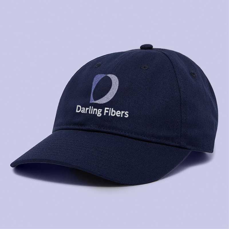
Darling’s logo variations allow the symbol to be readable in any format — horizontal, vertical, etc. For special applications, when the fiber strands are too delicate to be rendered, a filled symbol was created using two tones to maintain the symbol’s dynamic nature.

The Identity
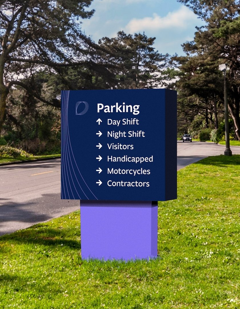
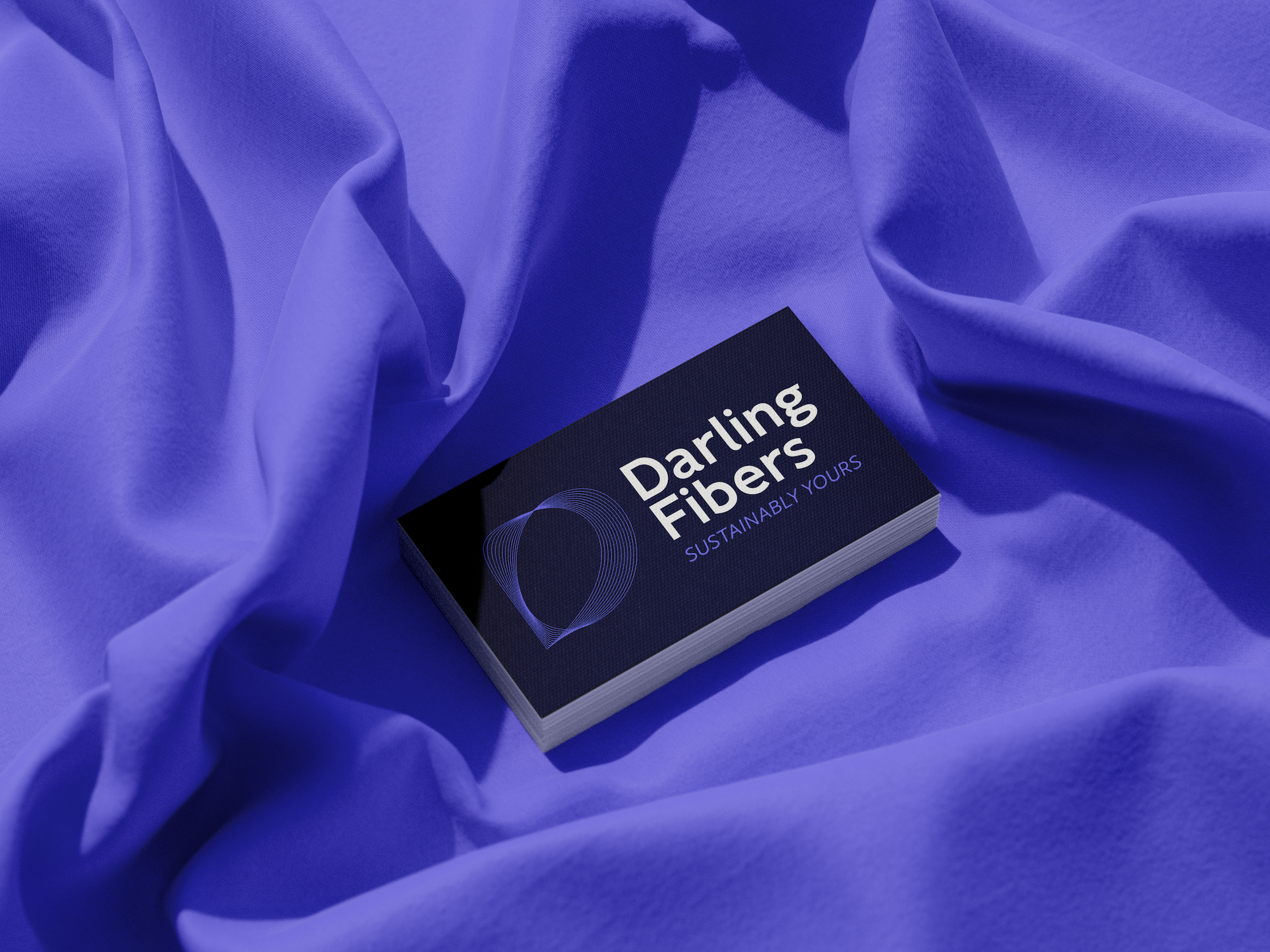
Darling Fibers’ color palette primarily uses navy blue and purple. Navy blue — as a continuation of Fiber Industries’ brand, as a reference to being made in the USA, and the South Carolina flag more specifically. Purple — to express creativity and innovation, and to create a tenderness associated with the name Darling and a southern-made product. The brand typeface, Fagun, further emphasizes these goals with its clean, open, and friendly style. The color palette expands to include additional shades of blue, purple, green, and orange.
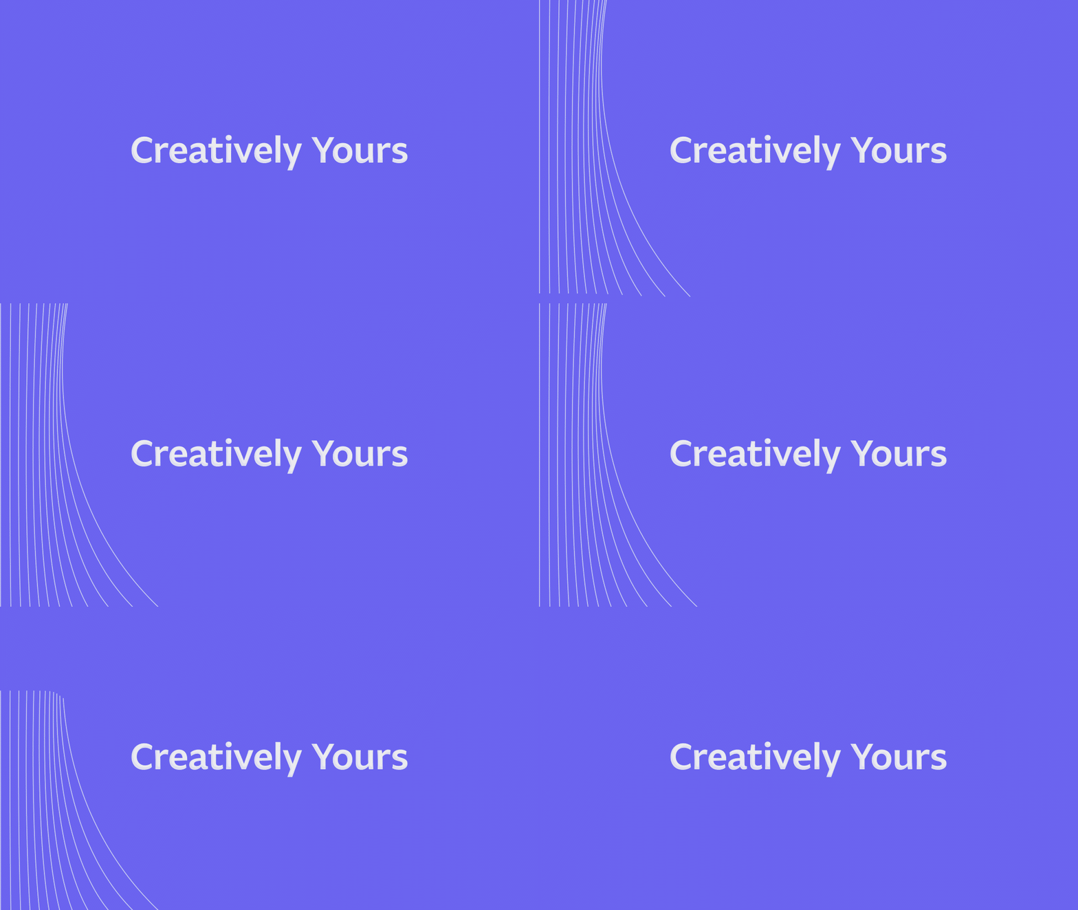
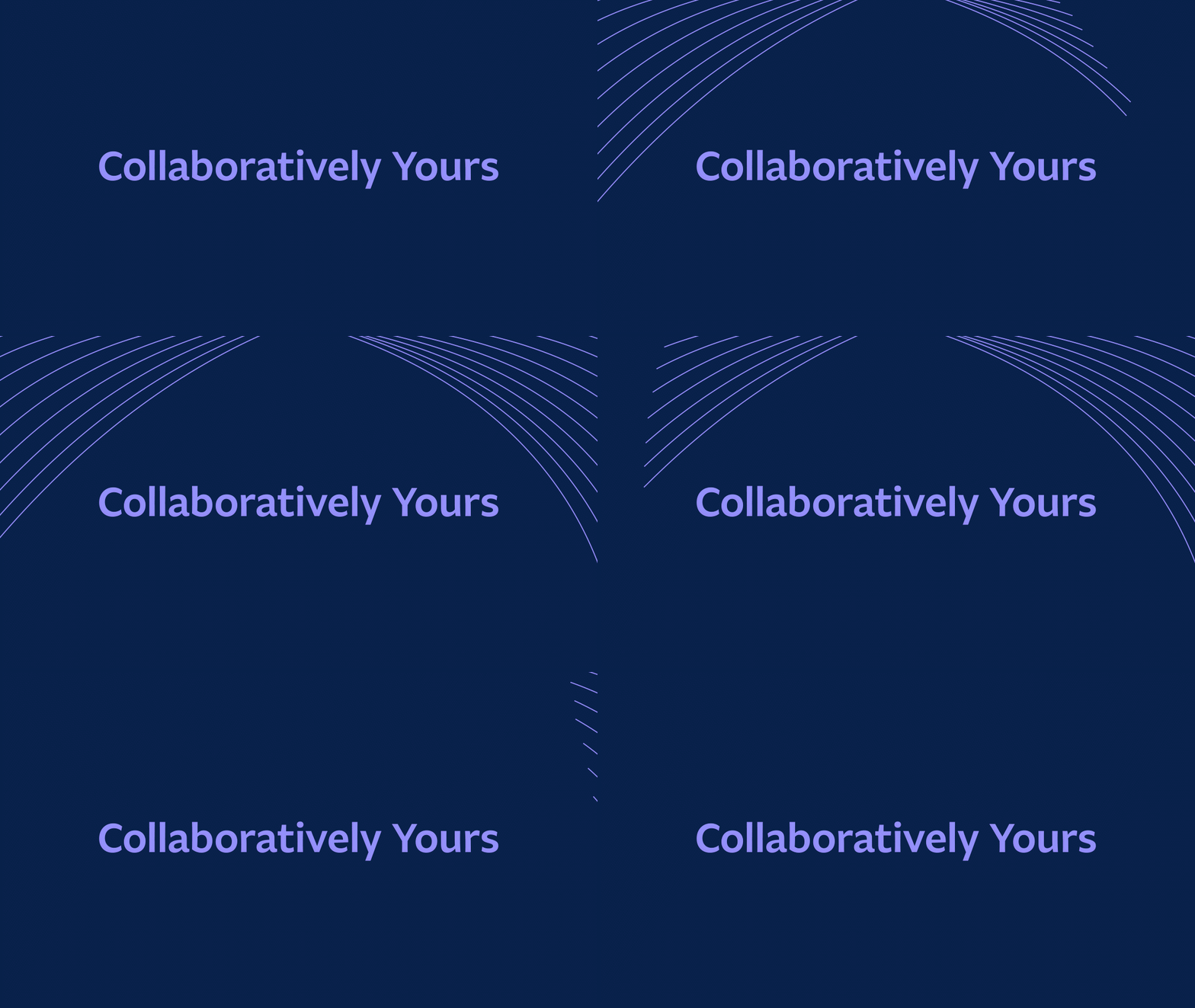
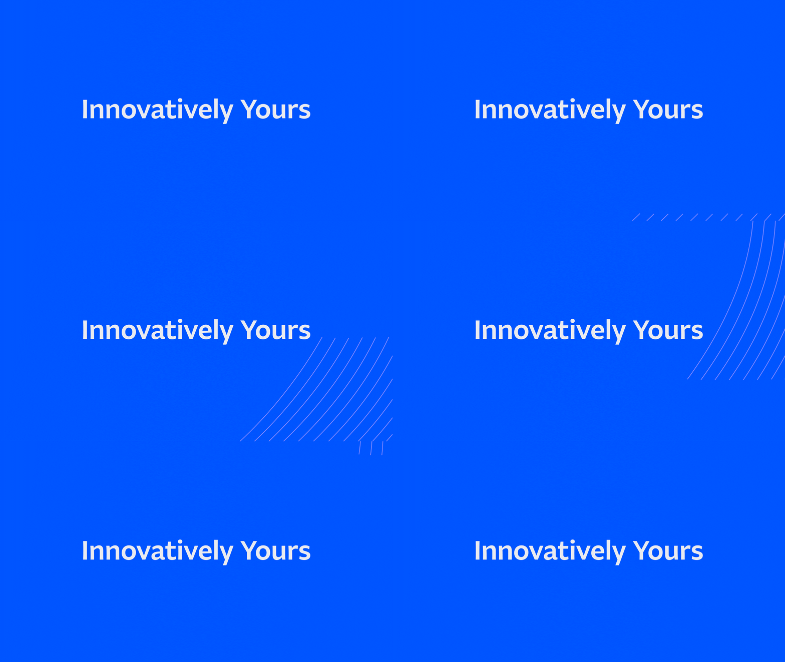
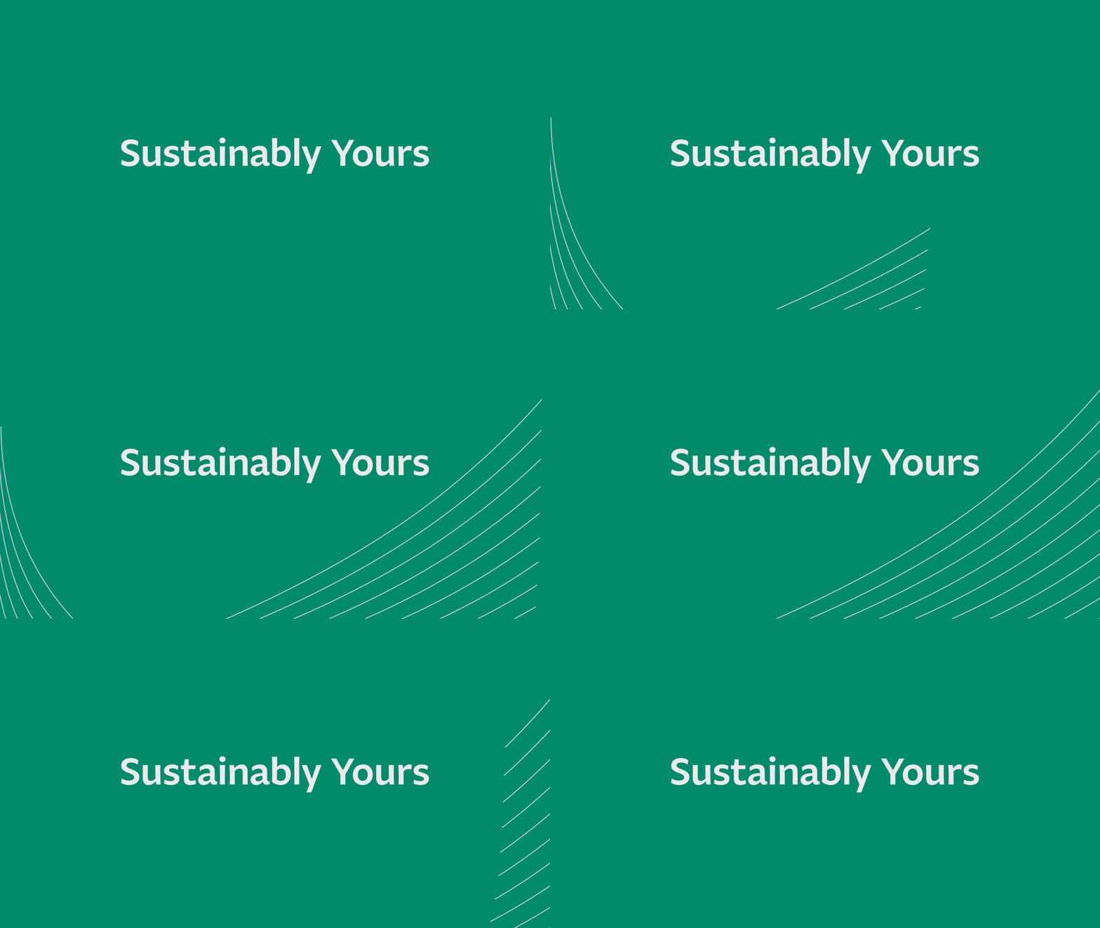
Gradient-filled icons create a modern look while being readable. Details from the brand’s symbol create dynamic and interesting corner elements.
A Piece of the Clover
As a part of Darling Fibers’ greater sustainability initiative, they plan to create Darlington Green, a sustainability hub and campus for innovation, at which Darling Fibers will be the center. Darlington Green’s logo fits within Darling Fibers’ brand identity and uses four rotated Darling D’s to create a clover — a reference to the greenspace to come. The brands combine to create a modern yet comforting identity to house the future of fiber in Darlington, SC.
