Symbol Design
CCCU Symbol
Client
Coca-Cola Credit Union
Role
Designer
Completed @ Copeland Design
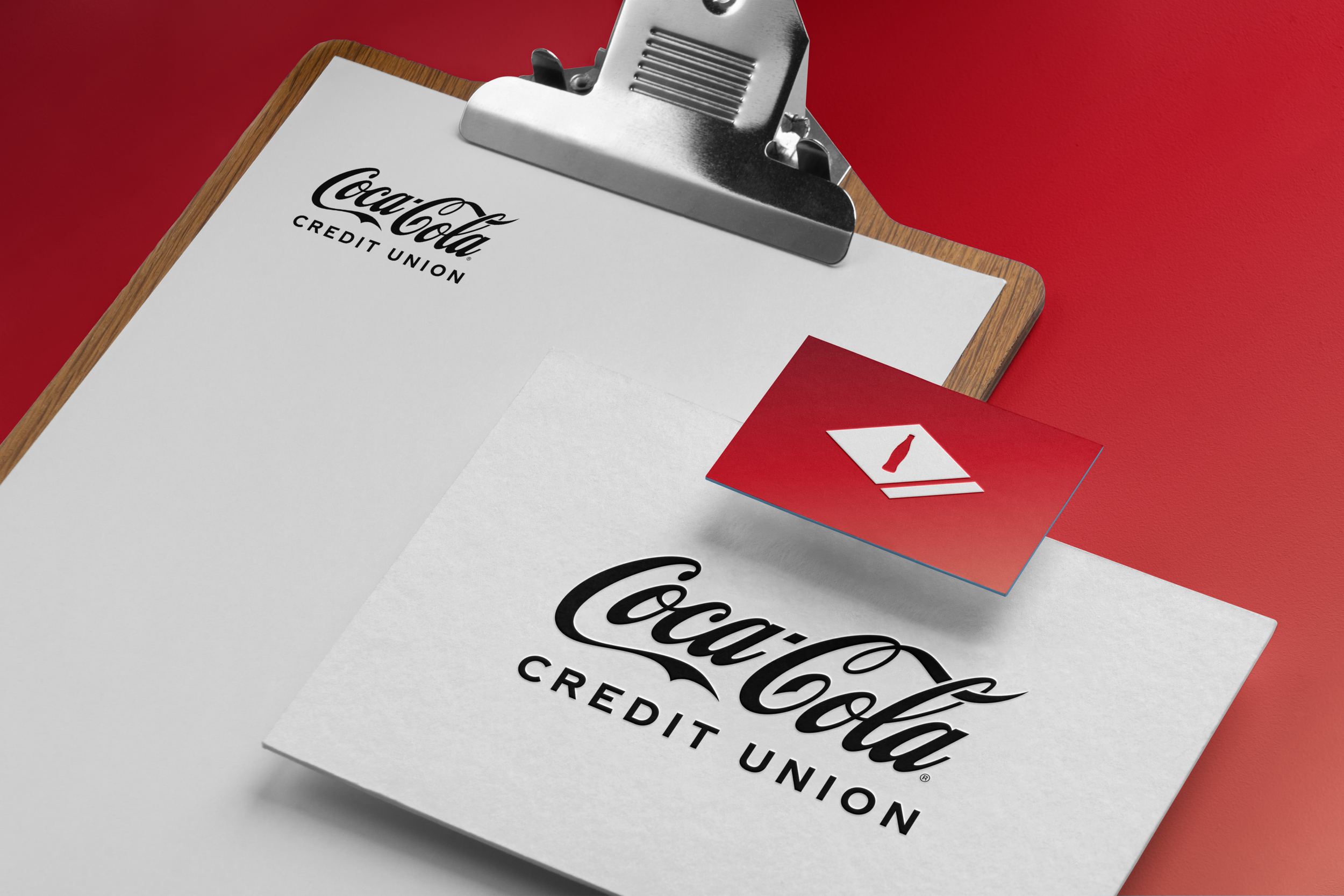
To promote brand-love and enhance the Credit Union’s connection to Coca-Cola’s heritage, Copeland created a new symbol for the Coca-Cola Credit Union.
Concept
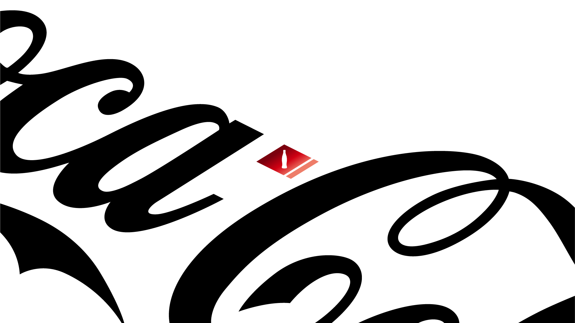
The 1906 bottle label immediately jumped out to me in The Coca-Cola Company’s archives. This heritage label creates a dynamic asymmetrical diamond shape. The connection was instant: a strong and bold shape to symbolize the strength and modernity of the Credit Union, while authentically connecting them to the Coca-Cola brand. This connection is reiterated by the inclusion of the Coca-Cola contour bottle. Additionally, I used the proportions of the Coca-Cola hyphen to guide the shape of the diamond. The symbol is distinguished for the Credit Union by applying their brand gradient to create a sleek and modern, yet comforting and confident symbol.


