Seattle Mariners
Identity Design, Branding
Redesigned an existing identity for a large organization.
Student Work, Savannah College of Art and Design

1977

1987
Current
About the Organization
In 1977, the Seattle Mariners emerged in Seattle, Washington as part of an expansion to the American League West in the MLB. The name “Mariners” comes from an entry contest. According to the MLB website the winner wrote: “I’ve selected Mariners because of the natural association between the sea and Seattle and her people, who have been challenged and rewarded by it.”
Concept
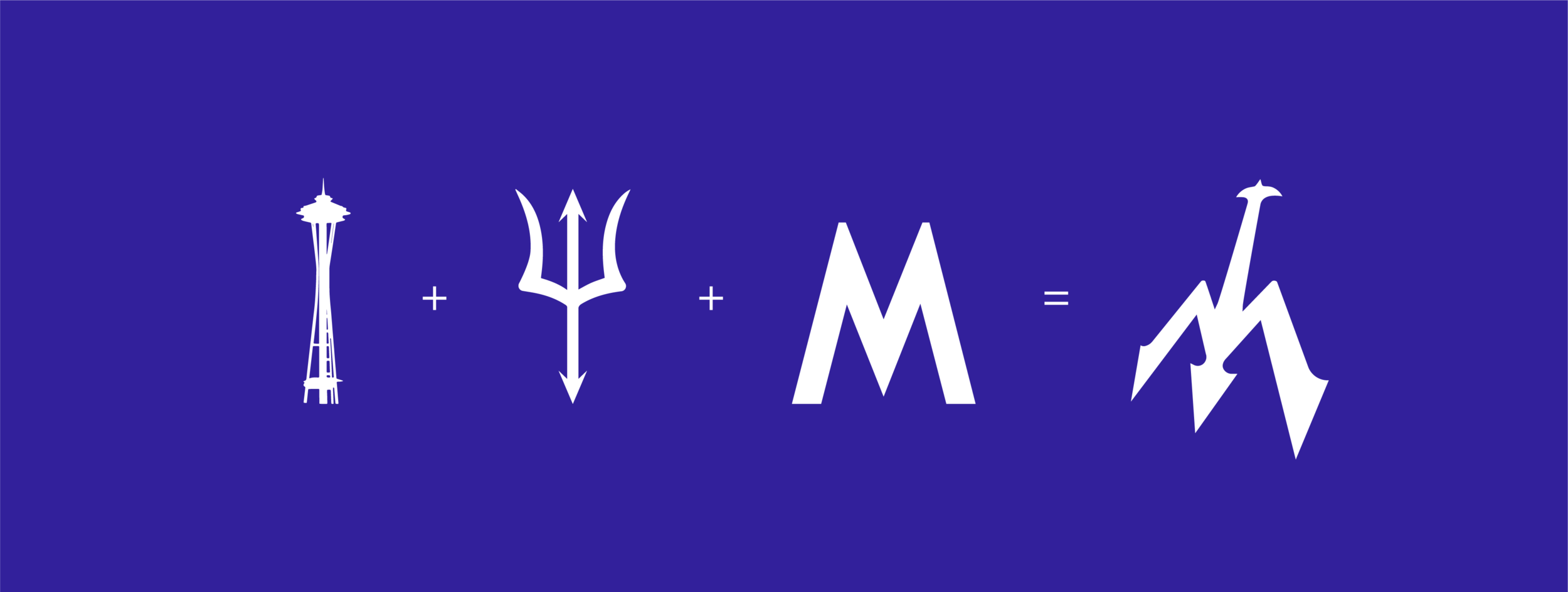
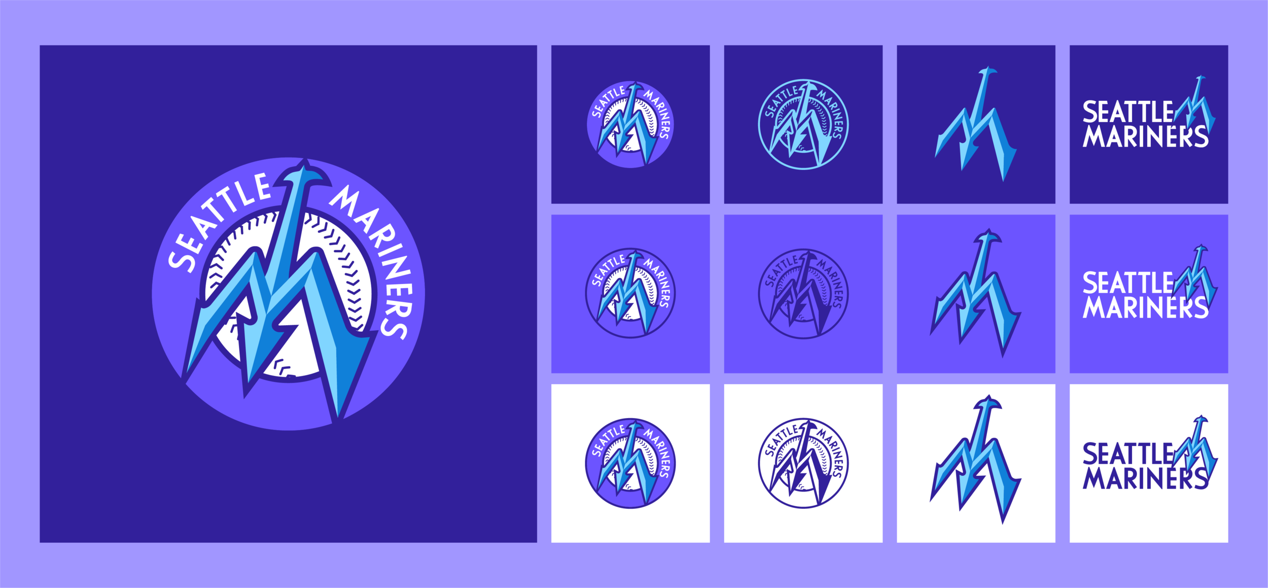
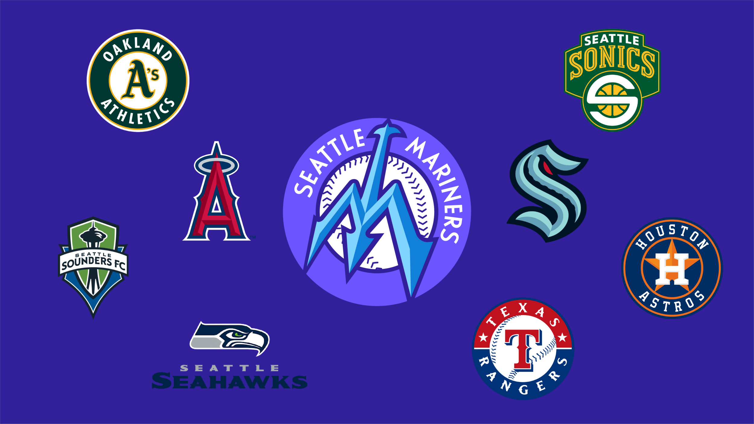
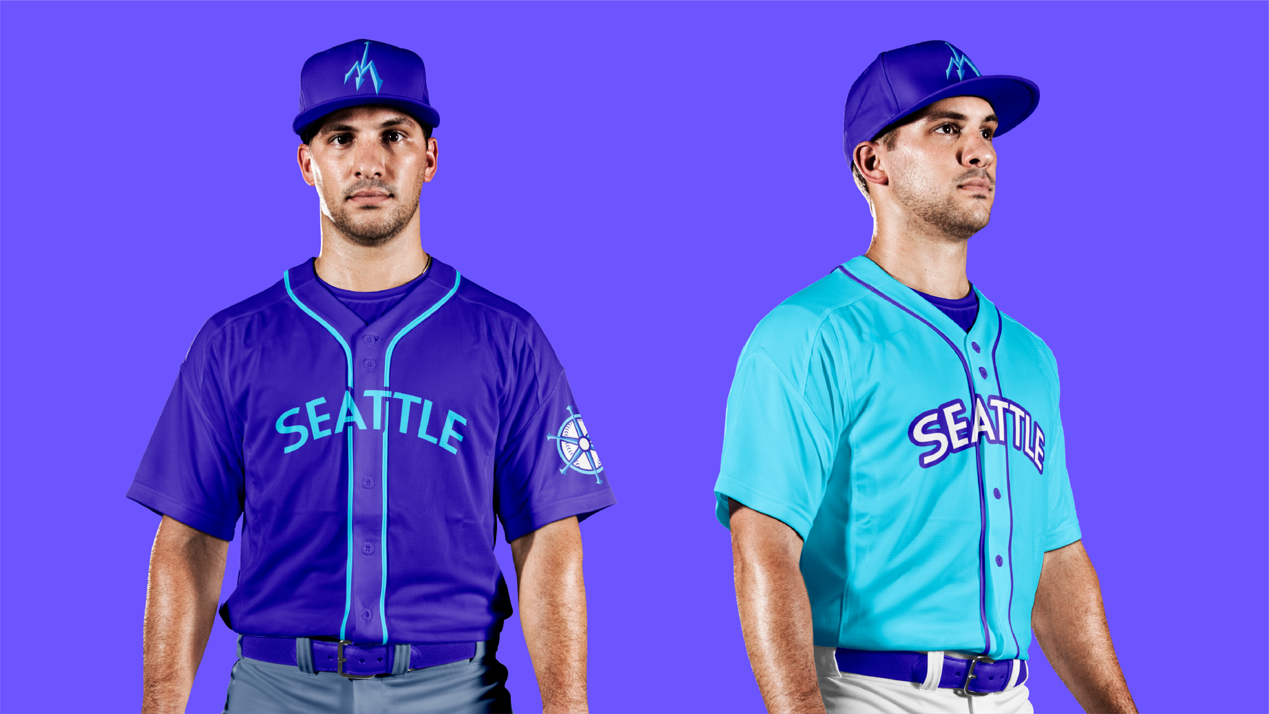
To return a sense of pride to the city, I reimagined the 1977 trident "m" symbol to become more active and livelier. The color scheme changed from dull shades of blue and green to a brighter, more playful palette with purples and blues, allowing for differentiation between their MLB opponents as well as fellow Seattle sports teams. Typography is a clean and timeless sans serif and can work inside the full emblem or be rearranged to accompany the trident symbol in any application.


For the Team
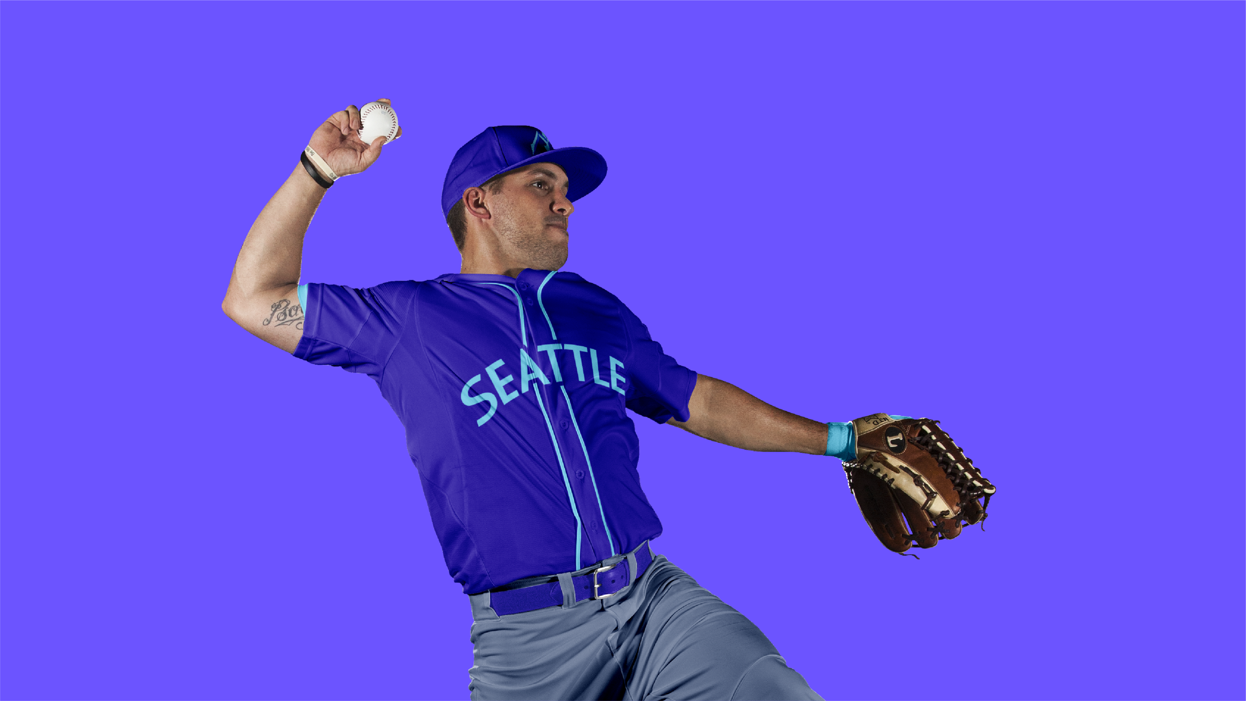
Home, away, and alternate uniforms utilize the bold color palette to help the team stand out at home and on the road. A shoulder patch was created in the shape of a ships wheel using the same features as the trident.



For the Fans
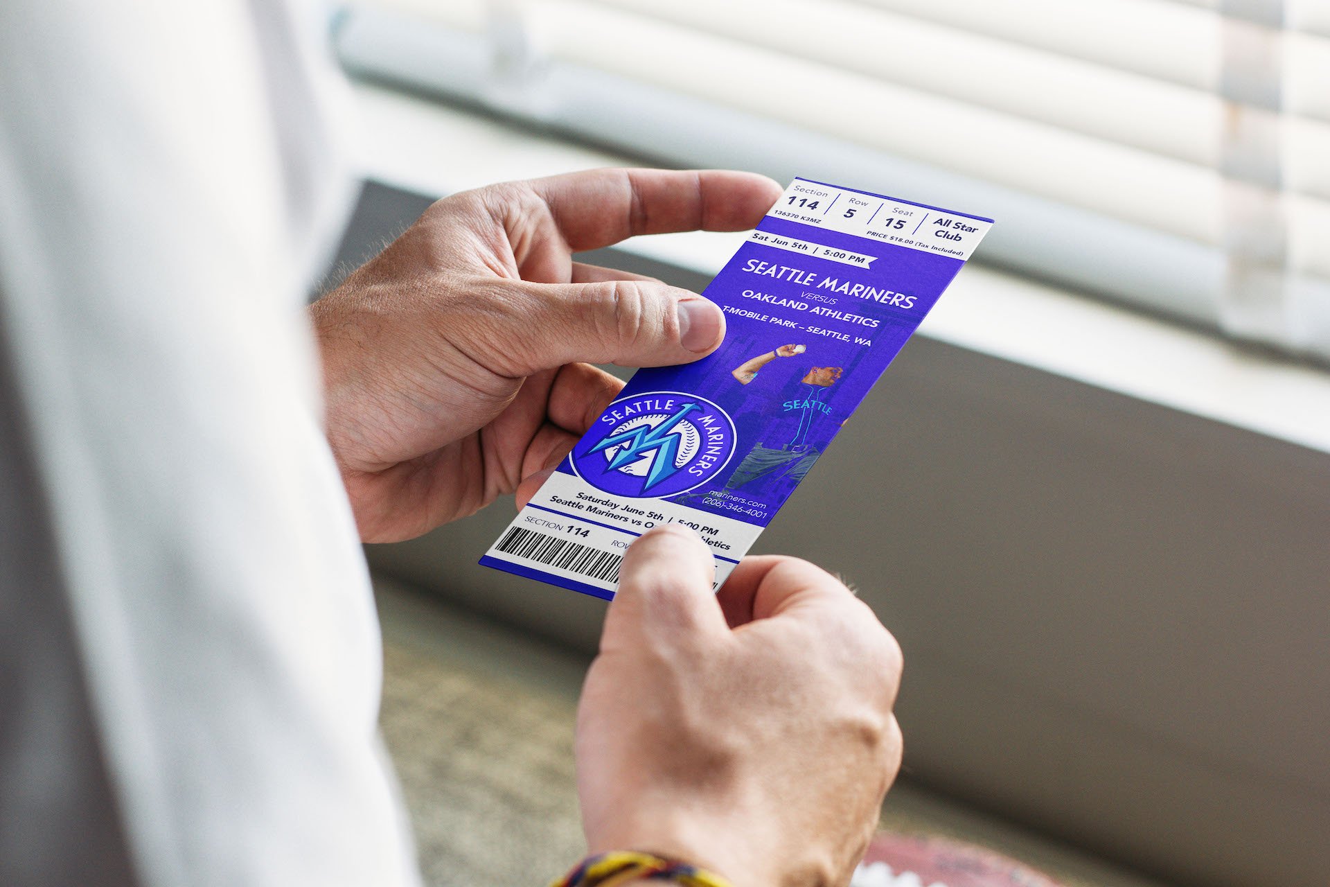
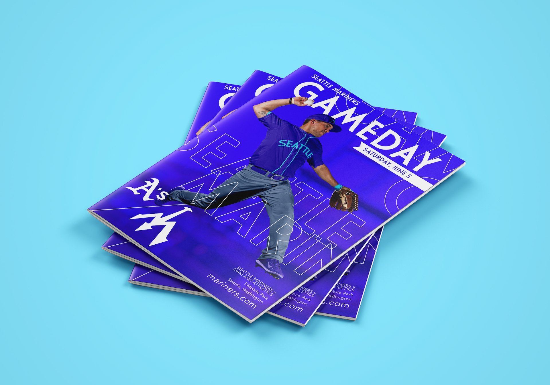
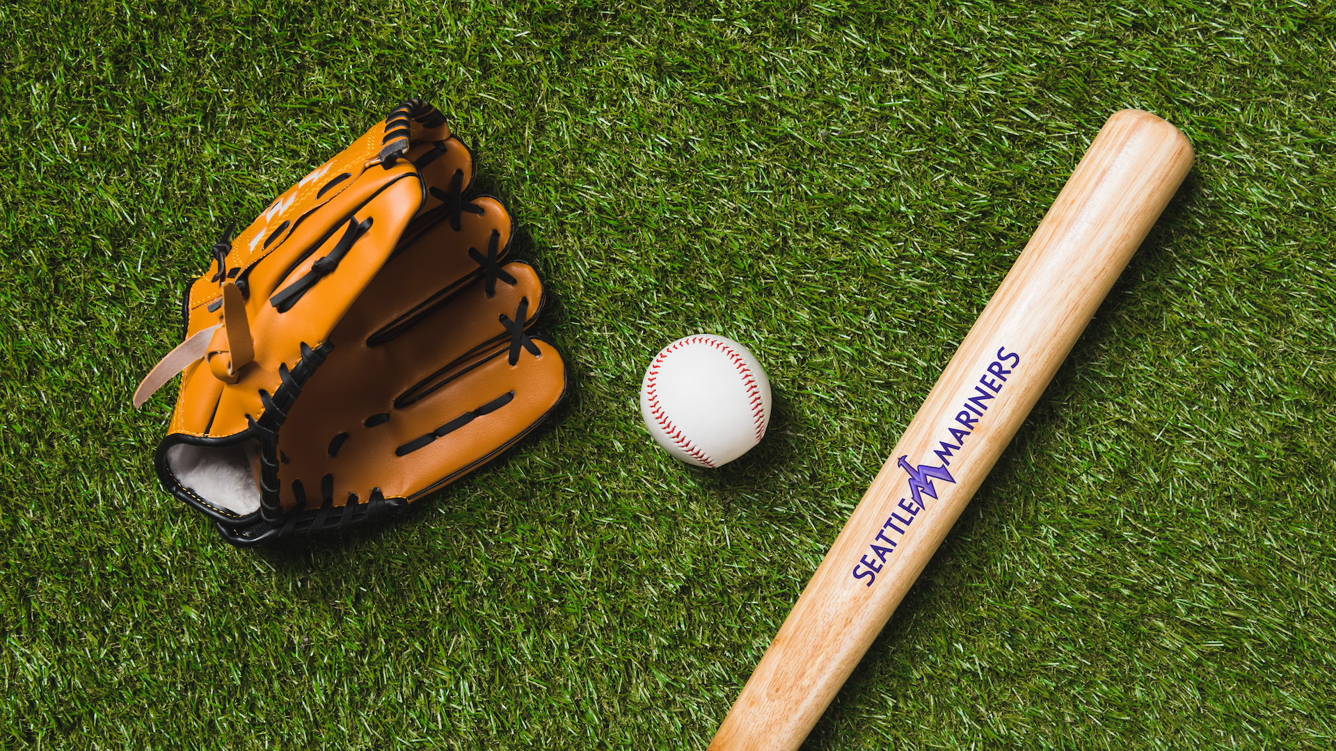
Tickets, gameday programs, apparel, and other goods were designed for fans using variations of the mark and the brand’s eye-catching and energetic color palette.
