Ratatouille
Publication, Typography
Strategized a multi-book publication using only typography for a movie script.
Student Work, Savannah College of Art and Design
About the Movie
A true underdog story — Ratatouille follows a cook in his pursuit of become a chef at a renowned restaurant in Paris. This chef comes from the unlikeliest of places as he, Remy, is a rat. He finds himself in Paris and befriends a human kitchen worker, Linguini, when they find out Remy can maneuver him to look like Linguini is the one cooking. The pair take the French culinary world by storm, not without their critics though, notably Anton Ego, and it is a race for Remy to prove his worth.
Themes
Overcoming doubt (in yourself and in others)
There is more to everyone than meets the eye
Don’t take anything at face-value
Follow your passions
Shifting perspectives*
Strategy
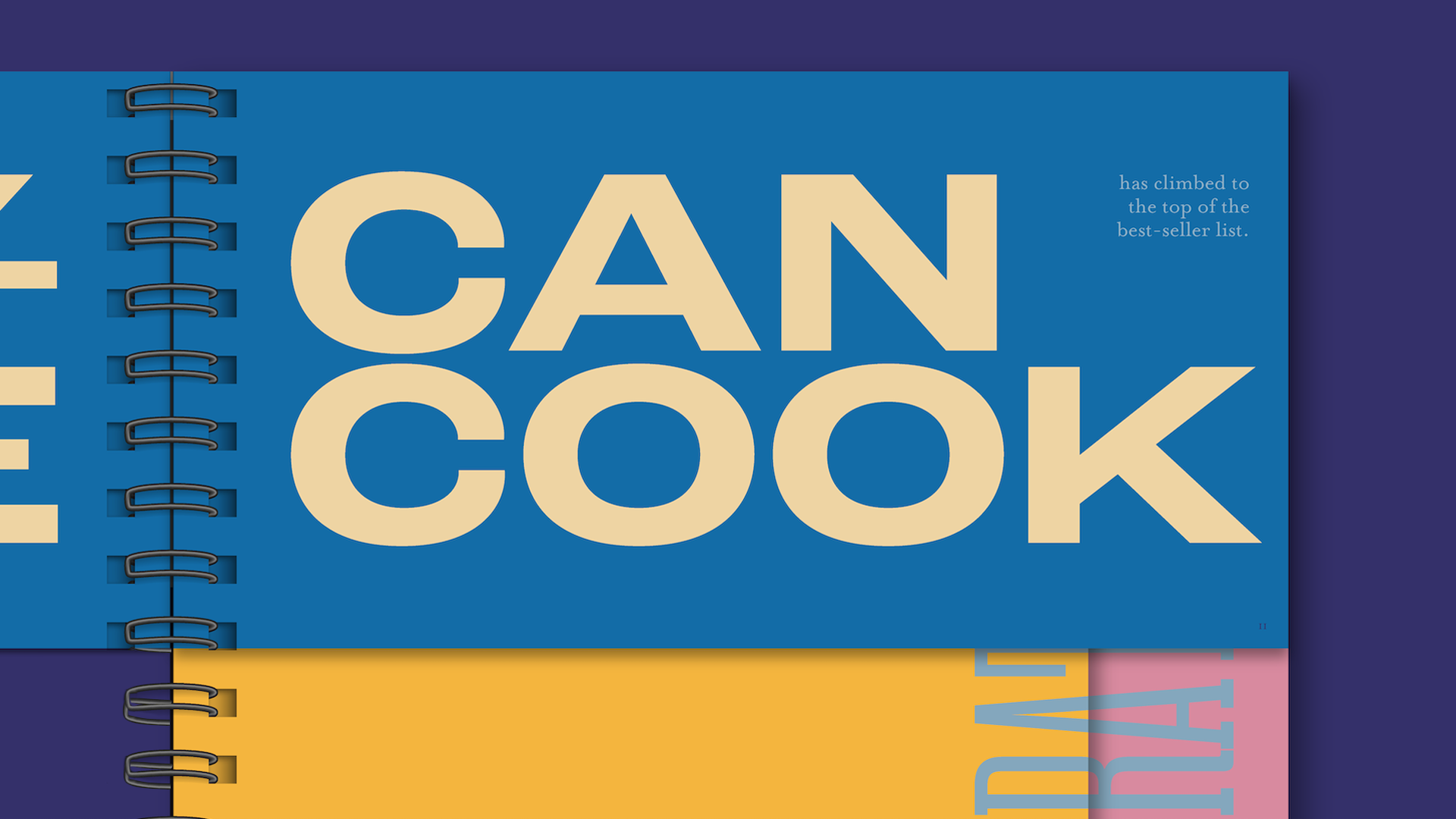
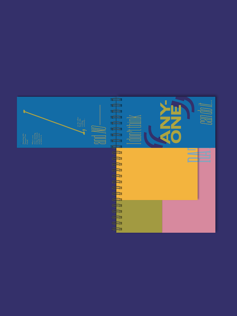
The main theme I focused on was the shift in perspectives for the characters as the story unfolds. As a result, I used rotated type to reorient the reader so they have to constantly rotate the book and physically change their own perspective to mimic the characters’ experiences. German painter, Ernst Ludwig Kirchner (read my full essay about the painter here) paints in an expressionist style using clashing colors and abstracted forms to evoke an emotional response. I utilized the same approach by using discomforting color combinations and expressive, sometimes warped, typography.

Concept
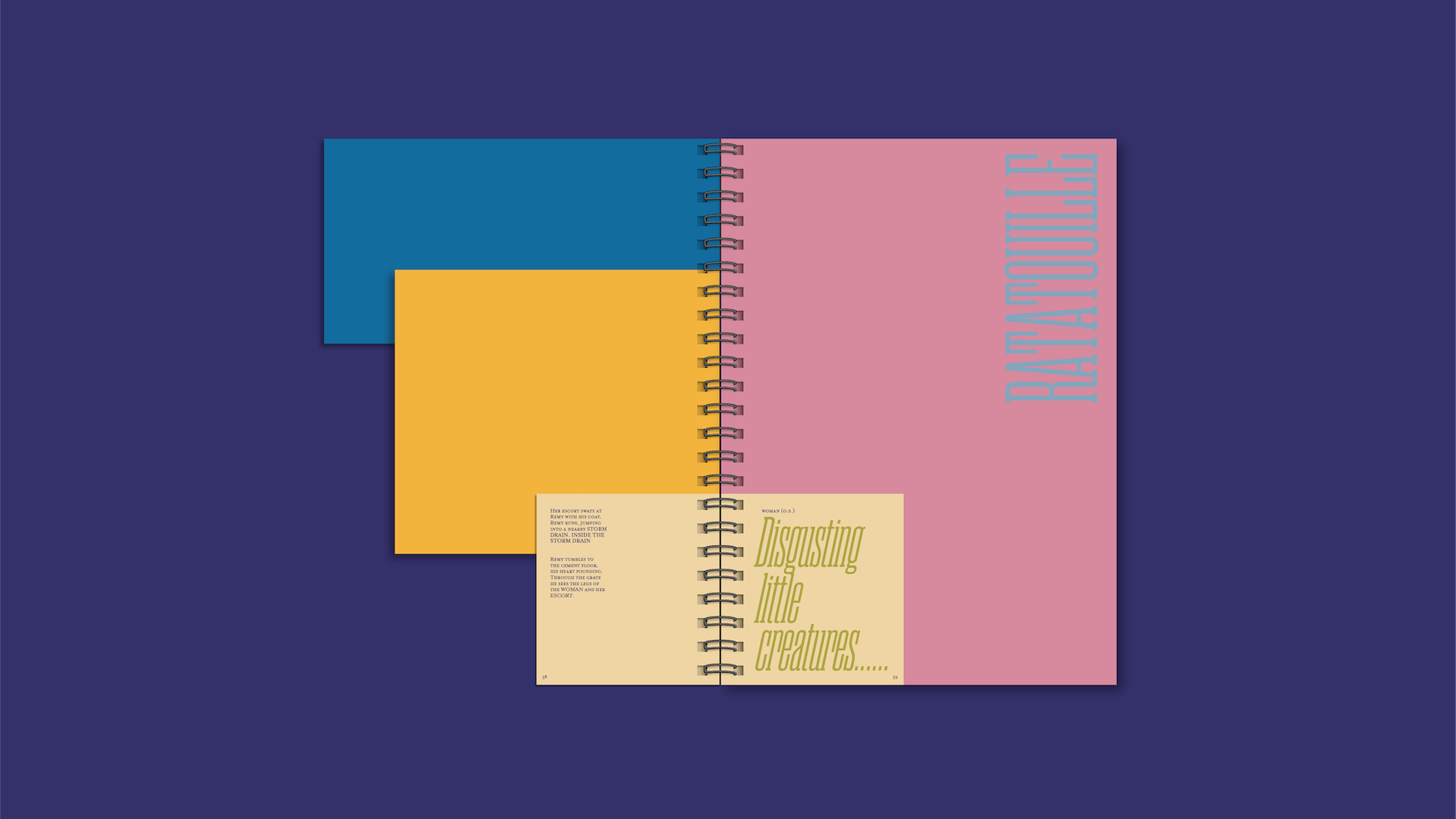
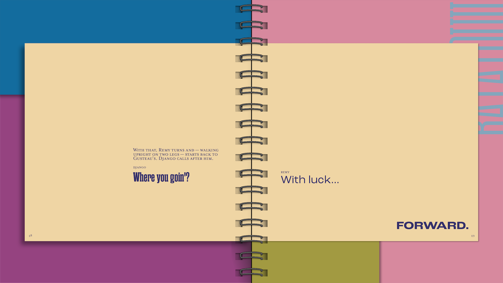
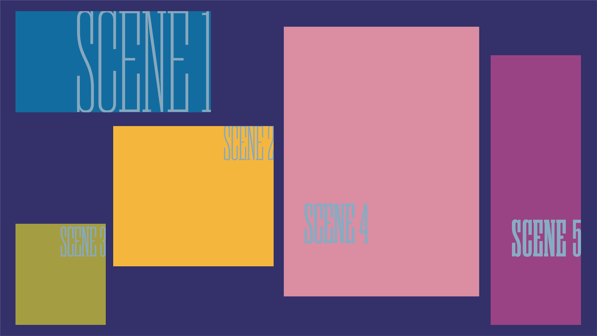
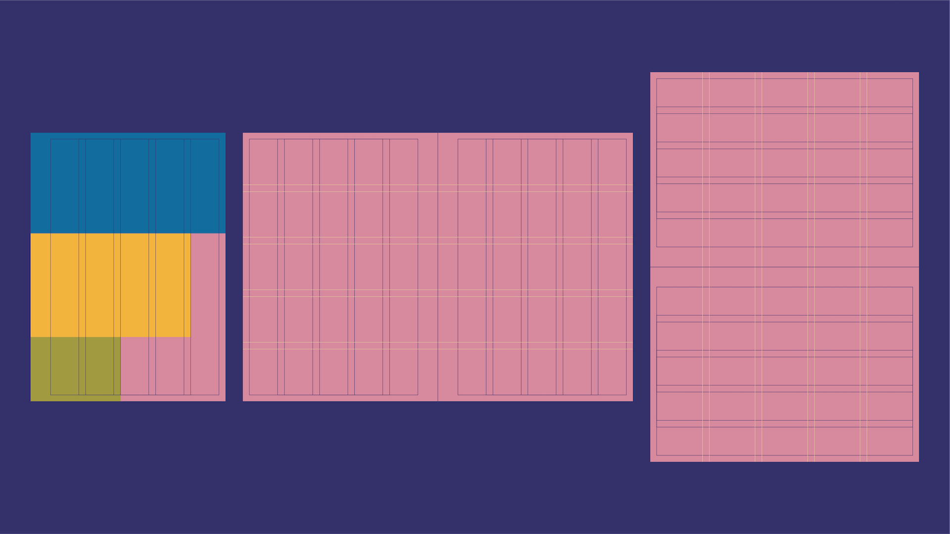
In order to organize the different scenes, each section has its own book, using proportions and colors (from Kirchner’s paintings) which reflect the mood of the scene. For consistency, an intentional, yet adaptable, grid was created to work within the varying dimensions. Additionally, the typefaces were chosen to represent the voice of the main protagonists (Remy and Gusteau) and antagonists (Ego and Django).


Execution
The individual books were arranged to overlap and create a certain level of consistency for the binding. In addition, each book covers a section of the following book, creating a space for the scene numbers to live in hiding before being revealed. The manageable scale allows the viewer to pick up and orient the book easily as they read the moving narrative while the page numbers act as a grounding element.

